Book Design - EducationDesign for the education market is frequently harder than for any other due to the fact that there are usually so many more restrictions on what's possible within the production time, format, and budget available. Information is usually denser, space tighter, budgets smaller, and end-use more specific, than for any other sort of text. Series design often has to cater for use by widely varying age-groups of students, as well as their educators, while still maintaining overall visual cohesion.
Series Logos and Mastheads These logos and mast-heads are for different education-market products produced by Longman-Pearson, MacDonald Publishing, Macmillan, McGraw-Hill, and Mimosa Publications.
Literacy Programs The Literacy Tree (Mimosa Publications) This graded-level reading series covered Grades Kindergarten-6 and was designed for a world market. Apart from series branding on the back-covers there was no series style. Instead, each book had its own design, so that the series looked like a mini-library that included a huge variety of book formats and types. Sizes and shapes of these books varied according to their reading level, and the text was always printed in black to allow for edition changes to different languages to maximise the marketing possibilities for the series. Click to view fiction and non-fiction.
Cambridge
Reading (Cambridge University Press)
Various author/illustrator pairs were used for this series and a different format was designed for each pairing's titles, and for the non-fiction components. This helped to distinguish the different reading levels in the classroom, and introduced some visual variety into the series. These titles are all for the lower-Primary level. Click to view fiction and non-fiction.
Rigby
Literacy (Rigby-Pearson)
This enormous reading program was a collaboration between Rigby offices all over the world and produced for a world market. Strict series guidelines were provided to the designers to ensure that all the components were compatible. Individual design variations had to take place within the guidelines. These examples are mid-Primary level readers. Click to view fiction. Mathematics Program Growing with Mathematics (Mimosa Publications-McGraw-Hill) The Growing with Mathematics program integrates the best practices of both early childhood education and mathematics education. Its development was informed by the key research that has provided insights into how young children learn and the factors that make early mathematics education effective and successful. The graded-level program covers Grades Pre-Kindergarten to 6 and was developed specifically for adoption and implementation in targeted USA state markets. It is now widely used. It was developed in stages over a three to four year period in Australia, and modified after consistent trialing in USA class-room environments. Program branding is very strong, and applied to all components of the program in a consistent way. The examples below show some Grade 2 components - the whole program has hundreds. Modular manuals, copies of student books, and photocopiable resources for teaching the core curriculum for each year are contained in a Teacher's File box for each level. Other components are supplied as separate items, sets, or kits - in many forms - boxed, bagged, bundled, cased, and rolled.
Click to view some component details.
Macmillan Library
Non-fiction
I've designed a few different series' for the Macmillan Library - usually sets of six books, always 32 pages, the same size, needing to be distinguishable at a glance in the classroom. The content varies greatly and there are always special features that need to be integrated into the page design, so that each set of books looks unique. Extreme Jobs This series introduced the concept of dangerous jobs requiring special skills. I designed a stressed surface to carry the main headings and graphics reminiscent of computer games menus for the special features type. Click to view covers, pages and detail.
Life in Indigenous Australian
Communities
This series compared and contrasted life in four remote
Indigenous Australian communities with life in other places, highlighting differences such
as schooling, food, facilities and culture. The culture of each community is outlined in
some detail and the books were designed to give a strong sense of each group's home environment,
by using the variable-quality author photos
as backgrounds to more specific images.
Click to view covers, pages and detail.
China: Land, Life and
Culture
This
series is a captivating insight into life in China, exploring aspects of daily life, culture,
history, traditions, and beliefs of the Chinese people. Special features included short
first-person accounts of daily life, information boxes, and a spread for each title outlining the
relationship between a Chinese and Australian organisation. I used a fabric pattern of dragons
and Chinese flowers, and lattice-work frames to provide a reference to Chinese tradition, and as
a counterpoint to the contemporary
images.
Click to view covers, pages and detail.
Our Body
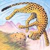
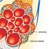
This series explains the workings of six major human physical systems.A page from an upper-Primary level series explaining how different human physiological systems work. The publisher requested a design style reminiscent of Dorling-Kindersley books for children of this age - with lots of white space, clear imagery and simple, elegant typography. Click to view covers, pages and detail.
Deadly and Incredible
Animals
I didn't design this series, but helped a hard-pressed
colleague with the text formatting, page layout and image adjustment. It's primarily included here to
demonstrate my layout and Photoshop skills, including creating backgrounds for images
of variable quality that had none when
supplied.
Click to view covers, pages and detail.
McGraw-Hill
ELT
My World
This six-level program to learn and teach English as a second language is pretty demanding and marketed primarily in South American markets. The books are accompanied by CDs for use with the exercises in the text at all levels. There is a some use of ephemera and many special visual elements, all of which needed to individually designed to stand out within the repeating format of grammar and vocabulary exercises. Almost every spread required some special treatment. Click to view pages.
We
Can!

This seven-level program to learn and teach English
as a second language is marketed primarily in Japan, with secondary Asian markets. The Student Book
text is accompanied by CDs to use with the text exercises, and a Workbook for supplementary work and
self-assessment.
The page design of the Student Books changed slightly every two levels to account for different course requirements and the nature of the content, as well as being a point of differentiation. A mixture of illustrators from Australia and Latin America were used to balance the demands of character styles and budget. Where possible, artwork and photos from the Student Books were re-cycled for use in the the Workbooks but we again used Latin American illustrators whenever we required additional pics for pages that differed to the Student Books. Click to view Student Book and Workbook page details. Blue Planet
Blue Planet is designed to teach English as a second language using science concepts. It is marketed primarily in Mexico, with secondary Latin American markets. At the publisher's request the Student Books use fonts at a larger size than normal for the user age-groups. Pages are dense, and don't allow for large headings, but did need section markers within each learning unit, so I used a band of colour to denote each four page section per topic within units. Bled pics on the unit opening pages, and bled colour on review pages delineate the units within each book. The covers all show an animal that is featured in the text. Click to view a unit.
Aboriginal and Torres Strait
Islanders'
Commission
These posters are part of a series, produced for dissemination through remote Aboriginal communities in Northern Territory and South Australia. Each poster had a theme relating to health, well-being, or identity and showed a specially-produced painting that told a story relating to the message being presented. Each painting was a different shape, with a varying amounts of text, so I split the format into three parts that changed proportion for each poster. In effect I created an earth and sky zone.
Aboriginal
Australia: Culture and
Society

This series of booklets for primary-school kids presented different aspects of Indigenous-Australian traditional life in detail. Each booklet contained historical information and also showed contemporary aspects of each theme.
Click to view pages.
Secondary-school Textbook
Cambridge Active Geography (Cambridge University
Press)

The covers for this Cambridge series had already been designed and approved so
my page format design was referential to the existing
style.
This series is typical of most secondary-school textbooks - jammed with
information that can really only work in two columns if pics, captions, and special features are
to be correctly juxtaposed to the main text. Clarity of
information within the text design and correct scaling of the images to communicate the
information they contain are paramount with this sort of format, which bring the designer's
planning and layout skills to the fore.
Click to view fiction and non-fiction. |
Peter Shaw Design Book Design Illustration Photography Workshops About Peter Shaw Resume+References Contact Publishing News Site Map


